Multimedia
How to Create a Favicon from a Logo: Small Versions, Contrast, and Export
Turn your logo into a readable favicon: decide what to simplify, prepare a balanced canvas, check contrast, and adapt each variant to its destination.

Why a Logo That Is Recognizable at Large Sizes Can Fail as a Favicon
A logo may combine a symbol, the brand name, a tagline, and fine details. When the entire composition is reduced to a small icon, the letters and shapes compete for the same space, and some details are no longer distinguishable.
That is why creating a favicon from a logo is not simply a matter of reducing the file. Keep the features that identify the brand and remove anything that does not add value at that size. The key question is whether it is recognizable at the intended scale.
- Check whether the full name is still legible when reduced; if not, consider removing it.
- Identify the shape or visual feature that makes the brand recognizable without relying on details.
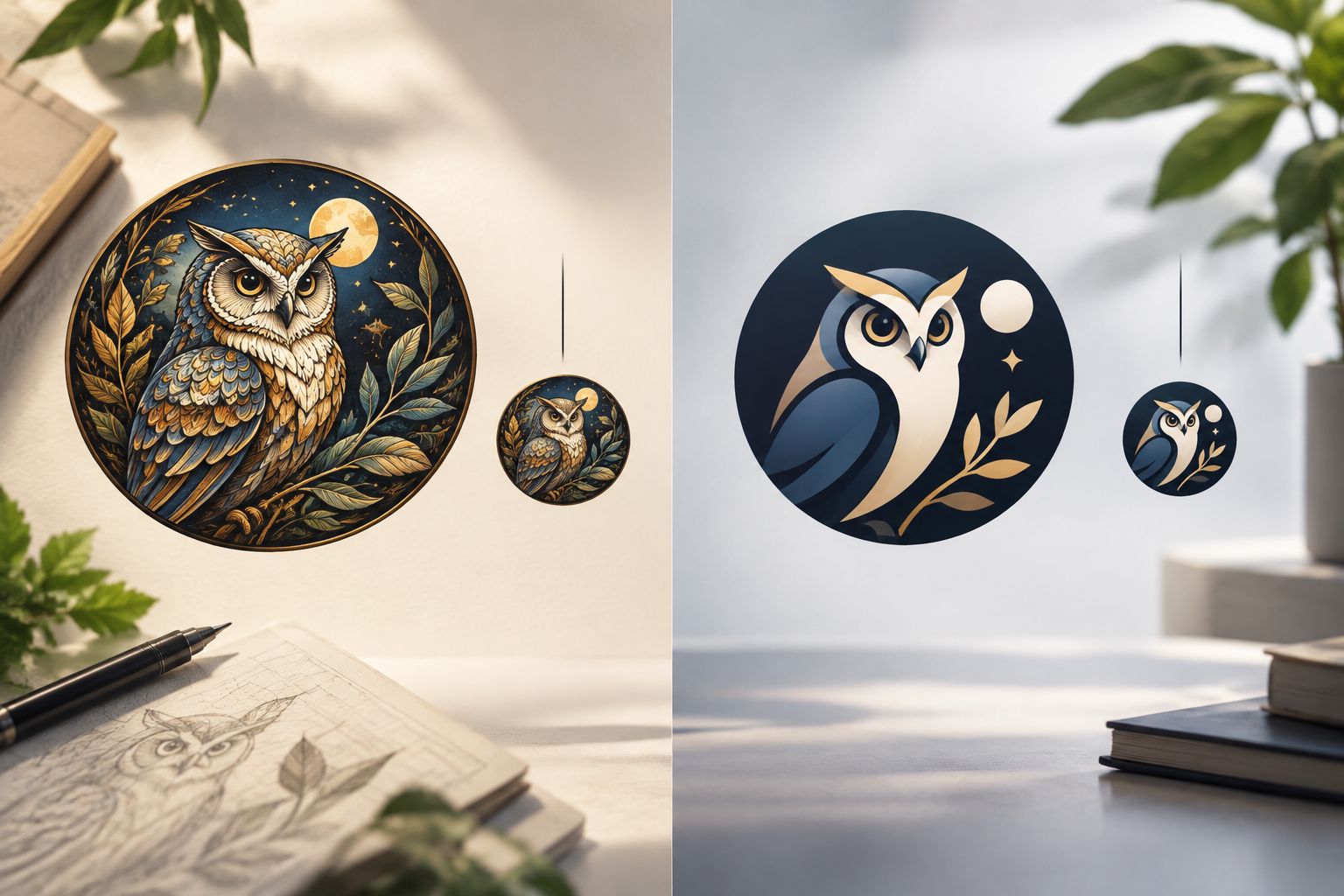
Choose What to Keep: Symbol, Initial, or Reduced Brand Version
Review the assets you already have: a standalone symbol, initial, monogram, or compact version of the logo. If you have a symbol that works on its own, it may be a practical candidate. If not, try a distinctive initial or a reduced composition. Choose a shape that can work at a small size rather than relying on the name being readable.
If you are unsure which to choose, prepare two or three alternatives and compare them on the same canvas at their intended display size. Discard options that depend on very thin lines, tiny interior details, or subtle color differences.
- Keep the most distinctive silhouette or feature rather than decorative details.
- Avoid adding new text if it cannot be read clearly at the intended size.
- Ask someone else to identify the options without explaining what each one represents.

Prepare the Square Canvas: Framing, Spacing, and Background
Start with a clean square canvas and place the artwork at the visual center, not just the mathematical center. An asymmetrical shape can look off-center even when its boundaries are equidistant; adjust its position by viewing it at a reduced size.
Leave space around the artwork so the shape does not look cropped or cramped. Also decide whether to use a solid background or transparency, depending on the destination's requirements.
- Check that the canvas is square and the artwork has not been accidentally cropped.
- Review the margins on all four sides and adjust the optical centering.
- Note whether each variant uses a solid background or transparency.
Check Contrast and Legibility
The contrast should clearly separate the artwork from the background. A combination that looks clear in a large view may lose definition when reduced, especially if adjacent areas have similar tones. Review each option against light and dark backgrounds; if the symbol disappears against one of them, consider preparing a suitable variant.
Check whether the silhouette and important parts are recognizable, and whether interior spaces remain open. If one line blends into another, make that detail thicker or remove it in a variant. Prioritize legibility over reproducing every nuance of the original logo.
- View each version against light and dark backgrounds, not just the editor's background.
- Check that gaps and separations remain visible when the image is reduced.
- Choose the variant that is easiest to recognize.
Prepare Variants for Each Destination
Before exporting, check the requirements of the site, product, or platform where each file will be used. Prepare the variants that destination asks for; do not assume a single image will work in every case. If the instructions are unclear, ask for confirmation rather than choosing specifications based on assumptions.
After exporting, open the files and check that the framing and background match what you intended.
- Identify the destination and check its specifications before exporting.
- Check the exported file, not just the editor's preview.
Review the Appearance in Its Intended Context
Review each variant at the size you prepared it for and check that it retains the framing, contrast, and chosen features. If the destination provides a preview, use it to check how the file looks in that context.
If something does not work, return to the working copy and adjust the relevant variant. Check the result again before marking it as ready.
- Confirm that the selected variant matches the intended destination.
- Check the final appearance and how the background behaves.
- If you find a problem, modify the working copy and review the export again.
Save and Organize the Versions
Keep the source asset, works in progress, and approved variants separate so you can identify the right file and avoid overwriting the original. Give each variant a clear name that distinguishes its intended destination or approval status.
Do not stretch the symbol to fill the square: adjust the framing without distorting the shape. If a final file turns out badly, return to a safe copy and prepare another variant.
- Preserve the original proportions of the artwork.
- Use clear names to distinguish proposals from approved versions.
A Workflow with Image Studio and Cloud
Image Studio lets you edit images on an integrated canvas with layers, text, shapes, and filters, and export them in modern formats. You can use these tools to work on the composition and prepare visual variants. Check the destination's specifications separately: editing features do not determine which file each platform needs.
Apification Cloud provides an organized, versioned space for managing and sharing files, reviewing an item's history, downloading previous versions, and restoring content. If you work with Image Studio and Cloud, use a transfer method that you have verified is compatible; do not assume there is a direct connection between them. Keep the source asset and the copies prepared for each destination clearly identified.
- Use Image Studio to edit images and prepare variants.
- Organize and share files through Cloud.
- If you need to transfer files between services, first check that the transfer method is compatible.
- Review Cloud history if you need to recover an earlier version.
Frequently asked questions
Can I use the full logo as a favicon?
You can try, but if the name or details are no longer distinguishable when reduced, it is worth creating a simplified version with the symbol, an initial, or a compact composition.
Will one file work for every destination?
It is best not to assume so. Check each destination's specifications and prepare the variants it requests; then check the files.
What can I do if the favicon looks good against one background but disappears against another?
Review the contrast and consider preparing variants for the relevant backgrounds. Also check whether the destination requires a solid background or supports transparency.
How can I avoid losing the original logo while preparing variants?
Keep the source asset separate from your working and approved versions, and use clear names to identify each file. In Apification Cloud, you can review previous versions and restore content.
Sources and further reading
Documentation consulted while preparing this article.
- Cómo crear un favicon a partir de tu logo — logopack.app
- ¿Qué es un Favicon y cómo crear uno e insertarlo en tu web? — José Facchin
Explore Apification
Related articles

Multimedia
How to Edit a Tutorial with Screen and Camera Side by Side Without Losing Readability or Sync
Decide when to show the camera alongside the screen and when to switch between them. Organize your recordings, check synchronization, and review an export before delivering the tutorial.

Multimedia
How to Add Audio Description to a Video: Script, Pauses, and Mixing
Learn how to select the visual information that needs narration, write concise descriptions, fit them between dialogue, and check the mix before publishing.

Multimedia
How to Hand Off an Editable Layered Design Without Losing Context or Assets
A useful handoff includes an organized editable file, the necessary assets, a visual reference, and a clear explanation of what should continue or change.